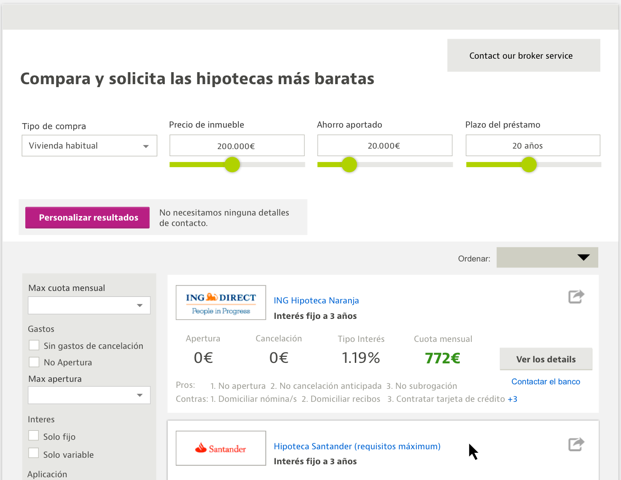

Mortgage Comparison Tool
The brief for the project was to design a comparison page that included a qualification process allowing users to get make more informed decisions.
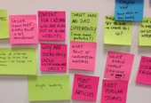
The project began with benchmarking, conversations with similar service providers in other countries, as well as user interviews and questionnaires.
From this initial research phase we were able to make decisions regarding for example the on-boarding process and integration into both our existing site and within idealista.com
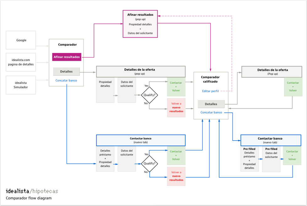
Defining the user flow
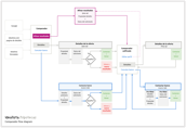
With a large number of stakeholders involved, all with their own needs and demands, it was important to establish a site structure that was universally agreed.
Defining the user flow not only simplified the design process but also the development work for the team. By establishing a strong structure at the start of the project, we limited the number of revisions and changes during the development phase.
57% of all traffic to the hipotecas site is from mobile devices
Mobile first approach
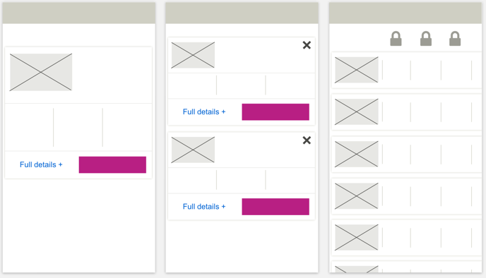

Designed ‘mobile first', the main UI challenge was the need for content complexity, whilst providing an experience that allowed users to easily choose their preferred mortgage.
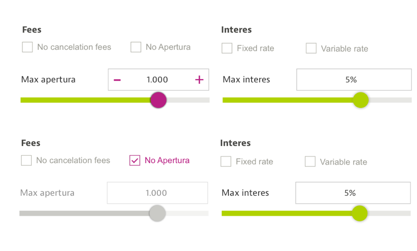
Through interviews and usability testing we were able to identify which content and filters were most important to users.
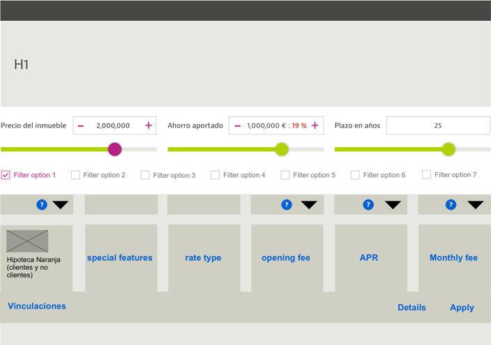
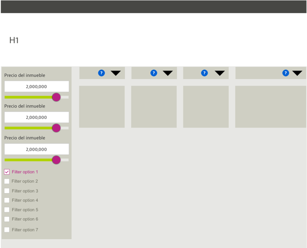
Filters top or left...?
The desktop version allowed for greater flexibility in terms of filter placement, and it was important to decide early on in the project due to the impact on the rest of the page.
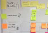
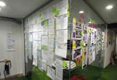
Benchmarking, sketching sessions and lowfi wireframing allowed us to explore options and gather opinions rapidly.
“idealista for mortgages”
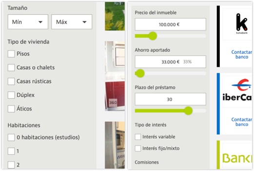

Due to the strength of the idealista brand, we decided to maintain a level of familiarity with the layout and features of the property search tool of idealista.com and implement the filters on the left.
This not only reduced the learning curve for users, but we decided that “idealista for mortgage” was a concept easily understood and explained by word of mouth.
The decion also meant we were able to maintain consistency across devices.
A MVP launch has allowed us to quickly learn more about how users really search for mortgages
Lessons learned...
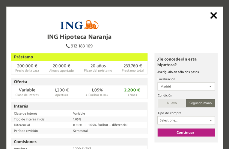

During the design process, based on research and team experience, assumptions were made in terms of how the user should interact with the detail pages.
It was decided to present the individual mortgage pages in a pop up. Although this was a more complex development, we felt that the experience for the user would be much more fluid, resulting in more exploration and ultimately more contacts.
Through usability testing however we quickly learned that for many users, due to the complexity and size of the page, it was simply not recognisable as a pop up. This led to confusion and uncertainty and at worst, users getting lost.
We made the decision to change the structure and to implement stand alone pages which saw a increase in user engagement.
What next..?
Continuous iterations based on analytics and usability testing.
We will also be focusing on how we can increase the traffic from our other pages within hipotecas.
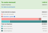
You can compare mortgages here
